Project Profitability Dashboard in Business Central
Build a project profitability dashboard in Business Central that survives executive scrutiny: 6 KPIs, drill paths, dvproject + dvfinance stack.

Most “project profitability dashboards” we inherit at new clients are not dashboards. They’re a slide with last month’s job ledger filtered down to whatever made the controller anxious that week. By the time the executive committee sees it, the numbers are 30 days stale, the formulas are in someone’s head, and nobody trusts the bottom line.
This guide is how we build the real thing — a project profitability dashboard inside Microsoft Dynamics 365 Business Central that survives executive review, drives weekly decisions, and doesn’t crumble when a project type changes. Written by a Microsoft Solutions Partner for Business Central implementing BC (and NAV before it) since 2003.
What “real” project profitability means (accrual vs invoice basis)
Project profitability has two legitimate definitions, and confusing them is the most common source of internal arguments at month-end.
Accrual-basis profitability measures the project’s economic performance during a period: hours worked × cost rate, materials consumed, subcontractor work delivered, all matched against revenue earned (by percentage completion, hours billed, or milestones reached). This is what your management accounts should reflect. It’s the version that determines bonuses, project manager scorecards and portfolio decisions.
Invoice-basis profitability measures what you actually billed and collected. It lags. A project that’s 70% complete on accrual basis may only be 40% invoiced because the milestone hasn’t triggered. Invoice-basis is what your cash forecast needs.
The two will never match in any given month. They should converge at project close. If yours diverge by more than 10-15% at close, your revenue recognition policy is probably broken — usually because the same cost lines are being interpreted differently by operations and finance.
The dashboard must show both. Showing only one is how PMOs end up celebrating “profitable” projects that quietly drained the cash account.
The 6 KPIs every PMO must own
After 20+ years building these dashboards for services companies, construction firms and engineering practices, the same six KPIs keep earning their place on the cover page:
- Gross margin %, project and portfolio — accrual basis, plotted against budgeted margin at sale. The single most-watched number.
- Estimate-at-completion (EAC) variance — actuals + remaining forecast vs. baseline budget. The leading indicator. If EAC is drifting upward week-over-week, the margin is already lost; you just haven’t recognised it yet.
- WIP (work in progress) value — unbilled costs + earned revenue not yet invoiced. Ageing matters: WIP older than 60 days is a red flag for stuck milestones or scope disputes.
- Billable utilization — billed hours ÷ available hours, by team and by individual. Below 65% and you’re carrying bench cost; above 90% and you’re burning your people out, which shows up as quality issues two quarters later.
- Cash recovery cycle — days from cost incurred to cash collected. Project managers obsess about margin and forget that a 25% margin with a 180-day recovery cycle is worse than a 15% margin recovered in 45 days.
- Pipeline coverage — booked backlog ÷ next-90-days revenue target. A profitability dashboard without a forward-looking metric is a coroner’s report.
A seventh useful KPI for delivery-heavy organisations: scope-creep ratio — change orders signed vs. unsigned. Unsigned change orders are pure margin leak and almost never appear on standard BC reports.
Building the dashboard: data sources, drill paths, refresh cadence
A dashboard is only as honest as its data flow. The architecture we use:
Sources inside Business Central:
- Job Ledger Entries (cost, price, hours) — the foundation.
- Job Planning Lines (budgeted + scheduled) — for variance.
- G/L Entries (overhead allocations, indirect costs) — to get from gross to net margin.
- Sales Invoices (issued, posted) — for invoice-basis metrics.
Sources from extensions:
- dvproject: enriched WBS, retention tracking, mixed billing models, certified hours from subcontractors.
- dvplanner: resource availability and committed allocation (so utilization isn’t just retrospective).
- dvfinance: bank-side reconciliation for the cash recovery cycle (Norma 43 imports, payment matching).
Layer on top:
- Either native BC list pages and Account Schedules (free, ugly, slow with >50 projects), or
- Power BI / dvdata-analysis as the visualisation layer, refreshed daily off a curated dataset.
Drill paths (executive view → operational reality):
Portfolio margin → Project margin → Task margin → Posting detail. Each level should answer “why did this number move?” without requiring a phone call to the project manager.
Refresh cadence:
- Operational layer (hours, committed costs): daily, overnight.
- Margin / EAC layer: weekly, ideally Monday morning so PMs walk into their week with fresh numbers.
- Revenue recognition / accrual: monthly, locked, with audit trail.
The single rule we enforce: no metric on the cover page that can’t be drilled down to the underlying postings in three clicks. Anything else is decorative.
Native BC vs dvproject + dvfinance + dvdata-analysis stack
Honest comparison — here’s where native BC ends and the stack starts paying back.
Native Business Central Essentials (Jobs module) is enough when:
- Under ~15 concurrent active projects.
- One billing model (or one dominant one).
- Single currency, single legal entity.
- The controller is happy with Excel exports for management reporting.
You need the dvproject + dvplanner + dvfinance + dvdata-analysis stack when:
- Mixed billing models on the same portfolio.
- Subcontractor management with progress invoices and retention bonds.
- Resource planning that drives the forecast (not just records the past).
- BI-grade reporting expected by the board.
- More than one legal entity contributing hours to the same project (intercompany resource sharing).
We don’t pitch the stack to companies that don’t need it. A 5-PM engineering firm running 8 projects on BC Essentials with clean Job Cards has no business buying four extensions. The honest test: if the PMO is exporting BC data to Excel more than twice a week to build their own reports, the stack pays back inside 12 months. If they’re not, it doesn’t.
Common pitfalls (revenue recognition mismatches, allocation errors)
Three failure modes account for most of the broken dashboards we’ve replaced:
1. Revenue recognition method mismatched to billing model. Fixed-price project being recognised on hour posting (instead of percentage completion) is the classic. The margin looks great in months when the team logged a lot of hours, then collapses in the month of delivery. The dashboard tells a story that doesn’t match reality and the PMO loses credibility.
2. Overhead allocation done outside BC. If your indirect costs (G&A, facilities, IT) are allocated to projects in a spreadsheet at month-end, the dashboard’s “net margin” line is fiction until that spreadsheet is run. Allocation rules belong inside BC (Account Schedules, Cost Accounting, or via dvproject overhead distribution). Out-of-system allocations are the single biggest cause of “the dashboard says one thing, the books say another.”
3. WIP not ageing. WIP is tracked as a total, never aged. Stale WIP — work delivered six months ago that still hasn’t been billed — sits in the balance sheet as an asset that’s actually a write-off waiting to happen. A proper dashboard shows WIP by ageing bucket (0-30, 31-60, 61-90, 90+). Anything 90+ should trigger a review.
A fourth, more political failure: dashboards built without the project managers’ input. If PMs don’t recognise their own projects in the numbers, they’ll build a parallel system in Excel and the dashboard becomes shelfware. Co-design with the people whose work it measures.
Sample dashboard layout for executive review
The structure we use for monthly executive reviews:
Cover page (6 tiles):
- Portfolio margin % (current month + 12-month trend)
- EAC variance (€, weighted by project size)
- WIP value with ageing breakdown
- Billable utilization (current + 4-week moving average)
- Cash recovery cycle (days, with trend)
- Pipeline coverage (next 90 days)
Page 2 — Margin drilldown: Top 10 projects by absolute margin contribution. Top 5 underperformers (margin variance >10pp vs. baseline). Always show absolute € and % side-by-side — a 30% margin on a €20k project is less important than a 5% margin on a €2M project.
Page 3 — Operational health: Utilization heatmap by team. Hours posting timeliness (% of hours posted within 5 days of work). Change order log (signed vs. open).
Page 4 — Financial / WIP: WIP ageing. Days-Sales-Outstanding per major client. Subcontractor commitment vs. invoiced.
Each page should answer one question, not five. Executive attention is finite — a dashboard that respects that gets used.
If you’re rebuilding your project profitability reporting on Business Central and you’d like a second opinion before locking the design, that’s exactly the kind of conversation we have weekly. Contact us or look at the dvproject extension and dvfinance extension pages for the technical detail.
Artículos relacionados
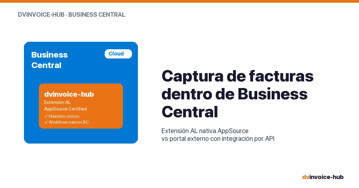
AP Invoice Capture in BC: Native Extension vs Portal
AP invoice capture in Business Central: why a native AL extension is more robust than external portals that break reconciliation and APIs.

OCR vs AI for AP Invoice Capture in Business Central
Classic OCR and AI-powered capture sound alike but do very different things. Why AI applied to your supplier base reshapes the 3-year ROI.

Best CMMS for European SMB Manufacturers
How to choose a CMMS for a 50-500 employee European plant. Buying mistakes, top alternatives compared, and when native-in-ERP beats a dedicated tool.